|
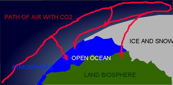
All the data I have analyzed are evidence that reported monthly averages are measurements of a global distribution of background levels of CO2. Event flask measurements that were exceptionally high (that could be from local anthropogenic sources) have been flagged and were not included in monthly averages. The result is a consistent global uniformity with no significant variation with longitude and a latitude dependent seasonal variation. That seasonal variation is the greatest and relatively constant north of the Arctic circle. There are similar but lesser seasonal variations in the Antarctic.
The Scripps data set from sites that were selected to represent background, http://scrippsco2.ucsd.edu/data/atmospheric_co2.html, has the longest time coverage for both CO2 and 13CO2 index. Much more data measured around the globe are published at the World Data Centre for Greenhouse Gases . The seasonal variations are caused by natural processes which are temperature dependant. Anthropogenic emissions are not temperature dependent. Therefore, evidence for an anthropogenic increase in atmospheric CO2, is more likely to be observed in long term changes with the seasonal variations factored out.
Year to year increasingly negative 13CO2 index values indicate that the atmosphere is accumulating the lighter CO2 faster than it does the heavier. Since the lighter is more from organic origin and the heavier more from inorganic, it has been assumed that the consistently increasing burning of fossil fuel has caused the difference. This assumption does not consider long-term changes in natural source and sink rates. The long-term proxied ice core data for atmospheric CO2 concentrations indicate that these natural changes are significant and should be considered in any mass balance type of calculation.
The C 13/12 ratio is calculated as:
Delta C13= ((C13/C sample)/(C13/C PDB)-1)*1000
If we assume that all the CO2 from organic origin can be represented by an average Delta C13 value of somewhere between -15 and -30, and that from inorganic origin has a value of 0 represented by the PDB standard, we can make a first estimate of the organic origin fraction by dividing the index by say -20. Actually, both fractions have ranges of values and there are inorganic fractionation processes that can produce values within the organic range. To get a better estimate of the average organic origin index value, regress the measured values of atmospheric concentration on the measured index values. The resulting concentration coefficient is an estimate of the average organic origin index value for the time period regressed. The ratio of the measured 13CO2 index to this value gives an estimate of the organic fraction. This simple conversion of the Delta C13 index to an organic fraction has no effect on the accuracy of values and reverses the sign so that the accumulation is shown as positive.
The Arctic data has both the highest background concentration values and the greatest seasonal variation. The seasonal variation is likely the results of the ever-changing unfrozen sink area (both ocean and land biosphere). We should be able to get a more accurate CO2 mass balance using these data from this primary sink area. Nearly all of the CO2 is coming from the south and is being delivered in the upper atmosphere.
So what do the Arctic data tell us? Take a look at what I have found at the two sources referenced above. The following plots are based on the monthly averaged data from all the land based measuring sites located north of 60N.
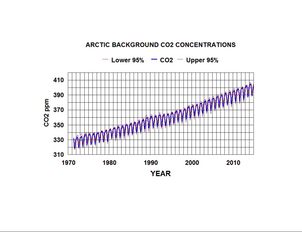
Fig 1. Arctic background CO2 concentrations as a function of time.
The above plot is point to point on averages of monthly averages of 18 sets of data. The average of all the two standard deviations is only 2.2 ppm. Any locational differences appear to be insignificant.
A similar analysis of 13CO2 index data yields the following plot.
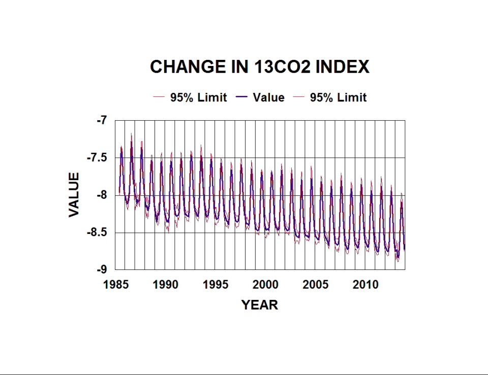
Fig 2. Change in 13CO2 index in the Arctic as a function of time.
This plot is based on eight sets of flask data from the same region north of 60N. The observed variations in both plots appear to be mirror images as one should expect.
To reduce the error estimates and improve the signal to noise ratio, both sets of data were smoothed by calculating running three months averages. Since we want to determine the relative natural and anthropogenic contributions, and anthropogenic emissions are rates, we are more interested in accumulation rates rather than the amount accumulated as shown in the above plots. The total seasonal short-term rates were calculated as running two month differences (i.e. 6*(Mar. Jan.). The long-term values are running twelve month differences (i.e. Jan. 2000 Jan. 1999). Anthropogenic Emissions assumes uniform global distribution with no sink rate and is shown for comparison with the net measured rates.
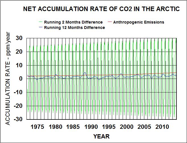
Fig 3. Comparison of net short-term and long-term accumulation rates with anthropogenic emissions.
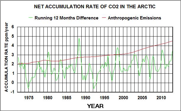
Fig. 4. Comparison of net long-term accumulation rates with anthropogenic emissions.
The seasonal variations (running 2 months) in all of these plots are orders of magnitude greater than the year to year variations (running twelve months). The two months net rates primarily reflect natural processes but may include anthropogenics that have cycled through the system.
The following are similar plots for the smoothed 13CO2 index values.
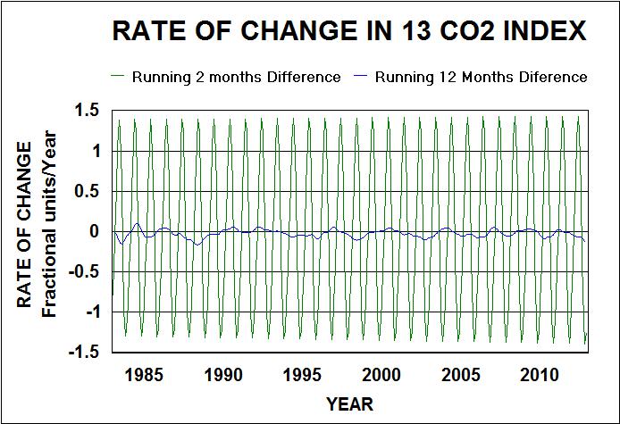
Fig. 5. Short and long-term rates of change in the 13CO2 index.
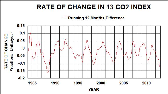
Fig. 6. Long term rates of change in the 13CO2 index.
Both sets of running two months differences fit a triangular wave form (cosine function with one harmonic) and an interaction with time term. The resulting R squares are greater than 0.99. Regressing the short-term CO2 accumulation rates on the 13 CO2 index rates and time times the index yields an index coefficient of -19.78 with 2 standard deviations (95% confidence limits) of 0.13. This is a best estimate of the organic fraction average 13 CO2 index mostly from natural sources. With this value I was able to calculate the organic and inorganic fractions of the natural annual cycles and estimate the relative contributions of each.
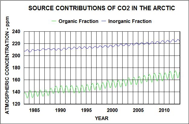 Fig. 7. Relative contribution to Arctic CO2 concentrations from organic and inorganic sources. Fig. 7. Relative contribution to Arctic CO2 concentrations from organic and inorganic sources.
The long-term linear trends accumulation rates are 1.17 ppm/year for organics and 0.57 ppm/year for inorganics. The seasonal variation of the organics is greater than the inorganics and with an opposite phase.
The running 12 months difference data indicate much lower rates that change significantly from year to year. The contribution of anthropogenic emissions should be evident in these data but does not account for the variability.
Regressing the long-term CO2 accumulation rate on both the long-term rate of change in the 13CO2 index, anthropogenic emission rates, and their possible interaction yields the following results.
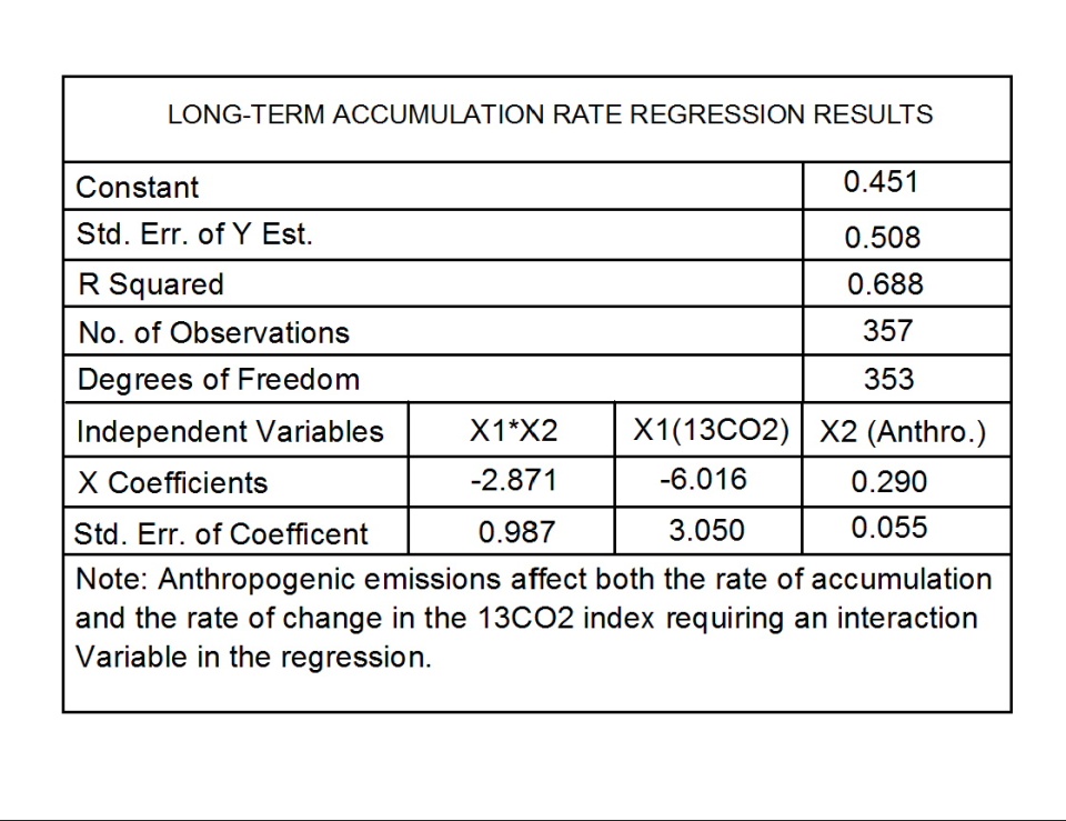
Table I. Results of regressing long-term CO2 accumulation rates on long-term 13CO2 index rate of change, anthropogenic emissions, and their interaction.
The following plot graphically presents these results for the anthropogenic contribution to the total long-term accumulation rate of atmospheric CO2.
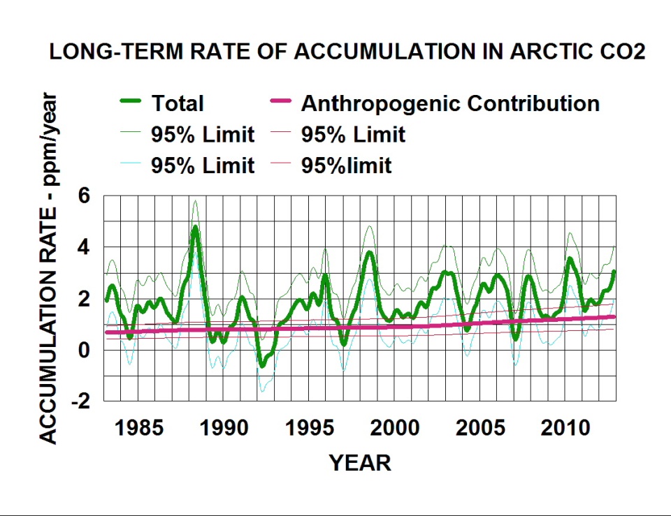
Fig. 8. Relative contribution of anthropogenic CO2 to the long-term rate of accumulation in the Arctic.
I used the anthropogenic emission rate coefficient and related estimate of error to estimate the accumulation of anthropogenic CO2 in the atmosphere/surface system. The surface includes water, soil and biosphere that are affected by cycles with wave lengths of less than around 500 years. For example, the decay of forest litter has a cycle wave length of about 10 years. Phytoplankton decay is expected to cycle CO2 faster. The results are shown in the following plot.
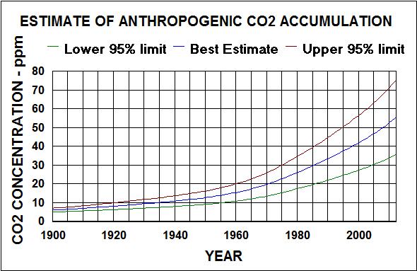
Fig 9. Estimate of anthropogenic CO2 accumulation in the global atmosphere/surface system from Arctic atmosphere data.
Subtracting the anthropogenic accumulation from the total long-term accumulation (with seasonal variations factored out) gives the net natural long-term accumulation. the following plot shows the results for the Arctic.
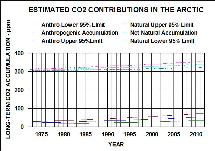
Fig. 10. Estimated contributions to atmospheric CO2 concentrations in the Arctic.
Both anthropogenic and natural emissions have been rising, with anthropogenics rising faster than naturals. This relative rise rate is shown in the following plot.
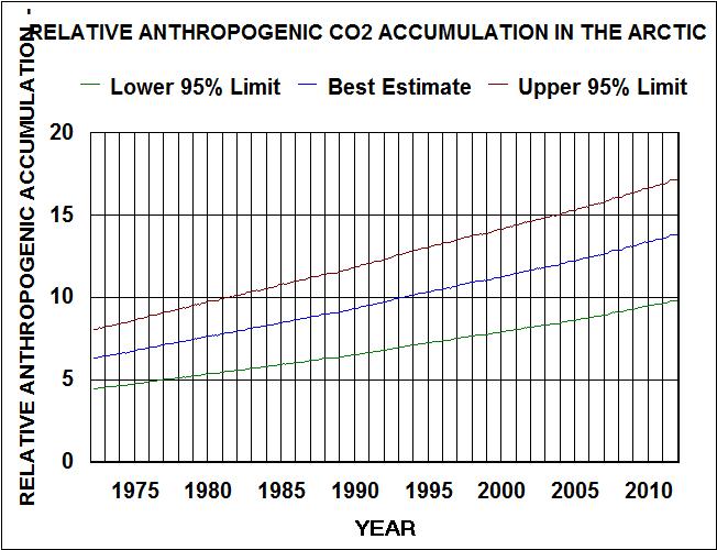
Fig. 11. Relative contribution of anthropogenic emissions to the atmospheric accumulation of CO2 in the Arctic.
This plot indicates that lowering global anthropogenic emissions to 1990 levels would likely lower the accumulation in the Arctic by less than 5%.
To show that the Arctic is representative of the global distribution of atmospheric CO2, I similarly analyzed both the Mauna Loa and Antarctic (south of 60S) data. There are multiple data sets of CO2 and 13CO2 index for both locations.
The following plots compare the results with that obtained from the Arctic data.
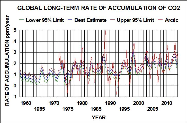
Fig. 12. Global long-term rates of accumulation of CO2 for Mauna Loa and Antarctica compared with Arctic.
The trends are similar but the Arctic data is much more variable and the peaks appear to lag by a few months.
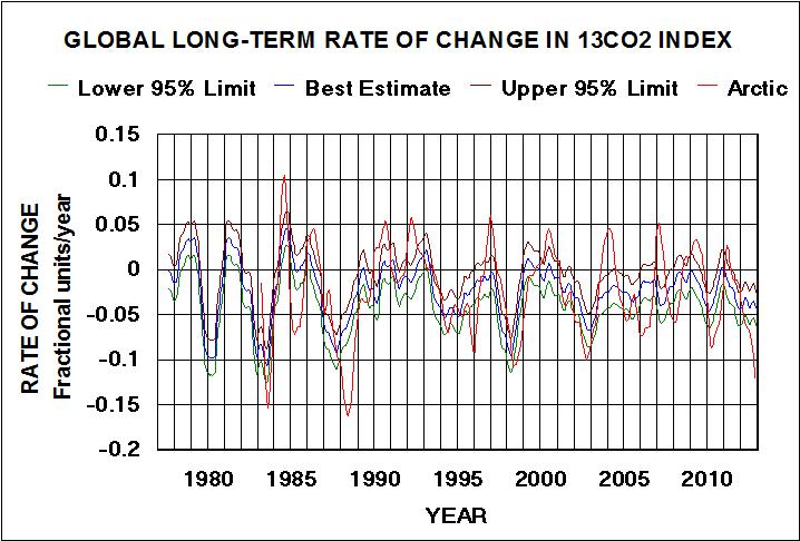
Fig. 13. Global long-term rate of change in the 13CO2 index for Mauna Loa and Antarctic compared with Arctic.
The same differences are observed in these results, but they are not as pronounced. Like the Arctic data, there is a strong relationship between the CO2 accumulation rate and the 13CO2 index for the Mauna Loa and Antarctic data. The latter should be a better global signature for atmospheric CO2 distribution and composition. I used the strong correlation ( R > 0.99 ) to calculate 13CO2 values back to 1957 (beginning of Scripps CO2 measurements). I then regressed the long-term CO2 values on anthropogenic emissions and an interaction term between anthropogenic emissions and the long-term rate of change in the 13CO2 values. The results are in the following table.
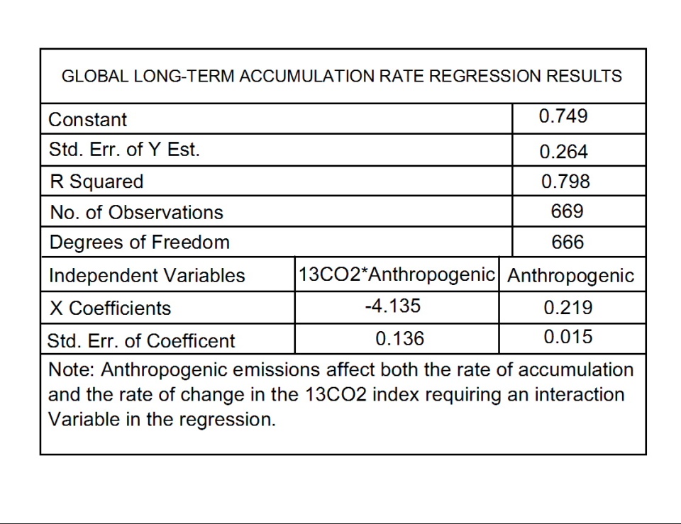
Table II. Results of regressing long-term CO2 accumulation rates at Mauna Loa and the Antarctic on anthropogenic emission rates and an interaction between anthropogenics and long-term rates of change in the 13CO2 index.
Comparing the results in Table II. with those in Table I. shows the correlation for Mauna Loa/Antarctic is better than for the Arctic. R is greater and the error terms are significantly less. The anthropogenic coefficient for Mauna Loa/Antarctic is less with less associated error, but well within the lower 95% confidence limit for the Arctic anthro coefficient. This coefficient is a better estimate of the fraction of anthropogenic emissions that is accumulating in the earths surface environment (water,soil, and biosphere). This coefficient was used to calculate the values for the following plot.

Fig. 14. Natural and anthropogenic emissions contributions to global long-term rates of accumulation of CO2 in the atmosphere. The natural contribution is the total long-term rate minus the anthropogenic emissions accumulation rate.
The natural component global signature looks like it was written by ENSO with matching variations and long-term change. I downloaded the NCDC v4 ERSST for the ENSO area (20S to 0 and 120E to 280E) from Climate Explorer, smoothed it with a 13 month running average, and regressing the long-term natural CO2 accumulation rates on these values and a cylical time function. The best fit is obtained with the CO2 accumulation rates lagging the SSTs by two months and a longer term lag associated with a 30.9 year wavelength cycle. The results are shown in the following plot.
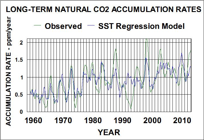
Fig. 15. Relation between natural long-term CO2 accumulation rates and sea surface temperatures in the ENSO area (20S to 0 and 120E to 280E) cycles lagged.
The two months lag indicates temperature is controlling natural emissions of CO2 rather than CO2 concentrations controlling temperature. The mechanism is likely the processes of evaporation/condensation/absorption/convection/freezing that occurs in tropical thunderstorms. These clouds are pumping air containing water vapor and CO2 out their tops where the water freezes and releases CO2. Much of the cold water returns absorbed CO2 to the surface in rain. This cyclical process tends to fractionate the CO2 isotopes with more of the lighter isotopes going out the top. The concentration of the lighter fraction in the upper atmosphere should be a function of the number of cycles. By the time that upper atmospheric air reaches the Arctic, CO2 will have gone through many cycles, resulting in the highest concentrations of the lighter fraction. This effect is added to the biological fractionation effect that, also, is temperature dependant.
To place the relative contributions to global long-term accumulation of atmospheric CO2 in perspective, I used the rates to back calculate 95% confidence limits for both natural and anthropogenic components . The results are shown in the following two plots.
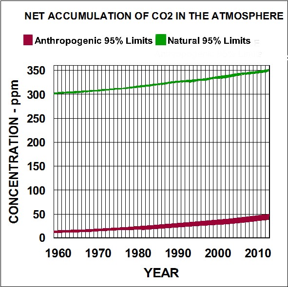
Figure 16. Global net accumulation of anthropogenic emissions and natural emissions of co2 in the atmosphere.
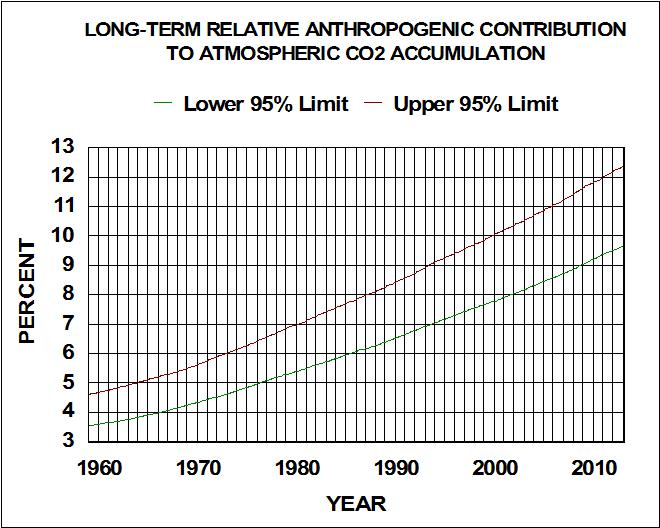
Figure 17. Global long-term relative anthropogenic emissions contribution to atmospheric CO2 accumulation.
Both natural and anthropogenic emissions have been increasing for over 50 years. Although anthropogenics represent a relatively small fraction of the total accumulation, that fraction has nearly tripled in the same time period. So what should we expect in the future and what effect would controlling anthropogenic emissions have on Global concentrations?
I did curve fitting on both the 95% limits of observed total long-term accumulation of CO2 and the estimated accumulation that is probably associated with anthropogenic emissions. I used a Fourier series type model for the total accumulation and an exponential model for anthropogenic emissions. The regression results for the total accumulation are given in tables III and IV.
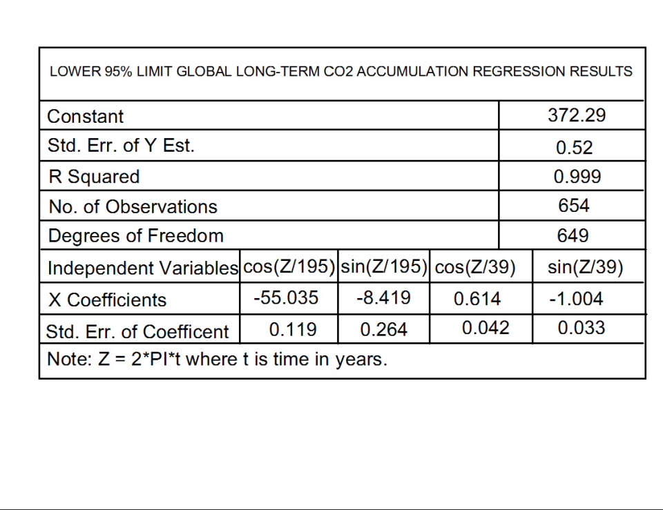
Table III. Lower 95% limit for global long-term accumulation of atmospheric CO2.
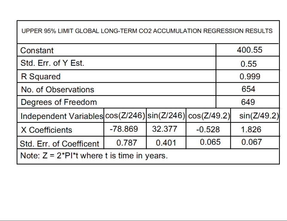
Table IV. Upper 95% limit for global long-term accumulation of atmospheric CO2.
The anthropogenic emissions CO2 accumulation best fits:
Lower 95% Limit = exp(-42.851+.0231*t),and
Upper 95% Limit = exp(-42.486+0.023*t), where t is years.
Both fits have R squared values greater than 0.999.
These relationships can be used in what if calculations to project what we may probably expect in the future. For example, the following plot indicates that atmospheric concentrations will peak out around 450 ppm around 2060 if emission rates continued as trended.
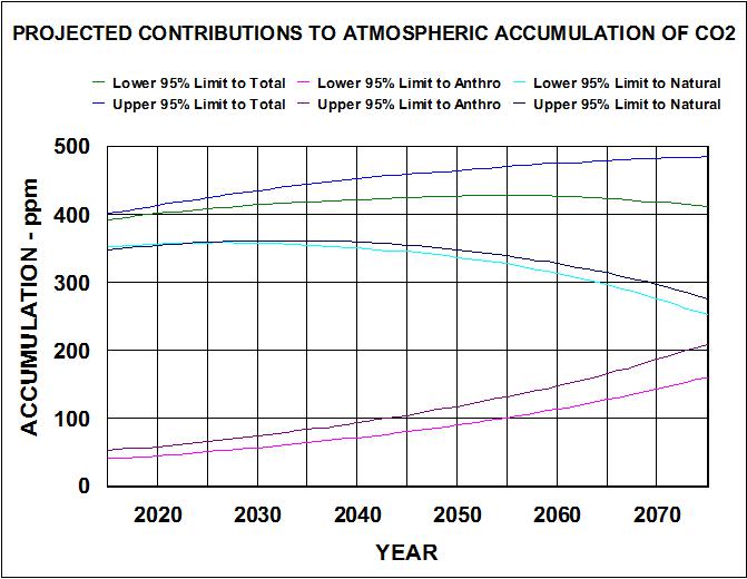
Figure 18. Projected contributions of natural and anthropogenic emissions to the long-term global accumulation of CO2 in the atmosphere.
These should be rather good projections for areas around 15S latitude where seasonal variations are relatively insignificant. Seasonal variations at other latitudes are additive to these long-term projections.
I conclude that, the IPCCs model assumptions that long-term natural net rate of accumulation is constant and anthropogenic emission rates are the only contributor to total long-term accumulation of atmospheric CO2, is false. It should be a simple matter for IPPC programmers to include these what if inputs in their models to see if they can produce more realistic projections. Also, they can enter lower anthropogenic emission rates to see how much (or how little) difference it makes in the value and time that atmospheric CO2 is expected to peak out. Economists could have a field day with cost/benefit modeling.
ABOUT THE AUTHOR
Fred H. Haynie is a retired environmental scientist who keeps researching all the available data about climate change. He has developed a presentation that shows ample evidence that anthropogenic emissions of carbon dioxide do not cause global warming. His thesis is that carbon dioxide has been falsely convicted on circumstantial evidence by a politically selected jury, and a just retrial could overturn this conviction before we punish ourselves by trying to control emissions that will have no effect on climate change. The interested reader can view the presentation to assess the evidence.
|
Risk Assessment: What is the Plausible
'Worst Scenario' for Climate Change?
Judith Curry
This article was originally published in
Climate Etc., 20 July 2015
We know that climate change is a problem but how big a problem is it? We have to answer this question before we can make a good decision about how much effort to put into dealing with it.
Climate Seer James Hansen Issues His Direst Forecast Yet. Jim Hansen has submitted a new paper for publication (cant find a copy yet). But it is already making a splash in the media. Excerpts:
James Hansen is now warning that humanity could confront sea level rise of several meters before the end of the century unless greenhouse gas emissions are slashed much faster than currently contemplated.
This roughly ten feet of sea level risewell beyond previous estimateswould render coastal cities such as New York, London and Shanghai uninhabitable. Parts of [our coastal cities] would still be sticking above the water, Hansen says, but you couldnt live there.
Is Hansens forecast plausible? Even Mann is skeptical (see his quote in WaPo article). What does plausible mean? What is the plausible worst case scenario for human caused climate change?
Climate Change: A Risk Assessment
I havent found climate change risk assessments to be very satisfactory, for a range of reasons. There is a new report out, entitled Climate Change: A Risk Assessment. IMO this is far and away the best risk assessment for AGW that I have seen. That said, it is far from perfect, for reasons described towards the end of the post (largely associated with how much warming we can expect, which is obviously the key issue). But IMO it has appropriately framed the climate risk assessment problem, and its authors (for the most part) dont seem to have any obvious agenda beyond . . . risk assessment.
From the summary on the Cambridge web site:
This report argues that the risks of climate change should be assessed in the same way as risks to national security, financial stability, or public health. That means we should concentrate especially on understanding what is the worst that could happen, and how likely that might be.
The report presents a climate change risk assessment that aims to be holistic, and to be useful to anyone who is interested in understanding the overall scale of the problem. It considers:
- What we are doing to the climate: the future trajectory of global greenhouse gas emissions;
- How the climate may change, and what that could do to us the direct risks arising from the climates response to emissions;
- What, in the context of a changing climate, we might do to each other the systemic risks arising from the interaction of climate change with systems of trade, governance and security;
- How to value the risks; and
- How to reduce the risks the elements of a proportionate response.
Some excerpts of relevance to formulating the plausible worst case scenario:
In assessing the risk of climate change, the immediate questions for any country anywhere in the world are: How serious is the threat? How urgent is it? How should we prioritise our response, when we have so many other pressing, national objectives from encouraging economic recovery to protecting our people around the world?
A risk assessment asks the questions: What might happen?, How bad would that be? and How likely is that? The answers to these questions can inform decisions about how to respond.
Climate change fits the definition of a risk because it is likely to affect human interests in a negative way, and because many of its consequences are uncertain. We know that adding energy to the Earth system will warm it up, raising temperatures, melting ice, and raising sea levels. But we do not know how fast or how far the climate will warm, and we cannot predict accurately the multitude of associated changes that will take place. The answer to the question how bad could it be? is far from obvious.
Consider the full range of probabilities. The biggest risks could lie anywhere in the probability distribution . . . particular importance of not ignoring low probability, high impact risks. It is a matter of judgment how low a probability is worth considering. When a probability cannot be meaningfully quantified, it is usual to consider a plausible worst case. Again, the question of what is a relevant threshold of plausibility is a matter of judgment.
What is the probability of following a high emissions pathway? Based on an analysis of current policies and plans for major countries and regions, it is very likely that the world will continue to follow a medium to high emissions pathway for the next few decades. If goals for reducing emissions in the EU and the U.S. and stabilizing emissions in China are achieved, then the highest emissions scenarios are less likely to occur, especially if India is able to displace a part of its anticipated construction of new coal-fired power plants with renewable energy capacity. But this will only keep emissions on a moderate trajectory, still far in excess of what is required to limit the impacts of climate change below a harmful level.
How likely are we to exceed the temperature thresholds weve identified? For any emissions pathway, a wide range of global temperature increases is possible. On all but the lowest emissions pathways, a rise of more than 2°C is likely in the latter half of this century. On a medium-high emissions pathway (RCP61), a rise of more than 4°C appears to be as likely as not by 2150. On the highest emissions pathway (RCP8.5), a rise of 7°C is a very low probability at the end of this century, but appears to become more likely than not during the course of the 22nd century. A rise of more than 10°C over the next few centuries cannot be ruled out.
Basically, they are using the IPCC AR5 here. The ensemble of climate model simulations for different emissions pathways should be regarded as individual scenarios of future climate change, and probability cannot be meaningfully quantified; see these previous CE posts:
Plausible versus possible
I have argued previously that the probabilities and even the likelihoods determined from climate model simulations are misleading. Which brings us back to What is the plausible worst case scenario?
Plausible seems a plausibly useful word, but one that is ambiguous. A dictionary definition of plausible: falls within the limits of what might conceivably happen. How is plausible different from possible?
Financial risk management has long grappled with these issues. The ASU-Oxford Plausibility Project has an interesting and relevant essay: How plausible is plausibility as a scenario effectiveness criterion? The essay doesnt come up with a definitive solution, but addresses the challenges of navigating between the too plausible and too implausible extremes.
I propose the following distinction between possible and plausible':
Plausible: a future scenario that cannot be rejected or falsified based on background knowledge. Scenario falsification was discussed in a previous CE thread.
Possible: a future scenario that is not consistent with background knowledge, but given the uncertainties in our knowledge can be regarded as possible.
Hence a plausible scenario is possible, but a possible scenario may not be plausible. As an example, I regard Jim Hansens sea level rise scenario as possible but not plausible (with the caveat that I havent read the paper and with the assumption that the paper presents no new observational evidence). Most alarming scenarios fall in this category of possible but not plausible.
Policy responses generally focus on the plausible scenarios, while continuing to assess the plausible worst case scenario and the plausibility of the far-out possible scenarios. There is a practical and philosophical issue of plausible versus possible ruin scenarios (see previous CE post).
Plausible worst case scenario
I regard there to be two main elements to formulating the plausible worst case scenario for human-caused climate change:
- The highest plausible representative concentration pathway (see previous CE post)
- The highest plausible equilibrium climate sensitivity (see previous CE post)
The highest representative concentration pathway formulated by the IPCC is RCP8.5. In a previous post Coal and the IPCC, Dave Rutledge argued that RCP8.5 was not a plausible scenario. I just spotted a post by Blair King entitled On RCP8.5 and the business as usual scenario, which also challenges the plausibility of RCP8.5. I suspect there are other challenges to the plausibility of this scenario, but I havent really looked.
With regards to climate sensitivity, see my previous post Climate sensitivity: lopping off the fat tail. Excerpt:
Gregor Betz defines modal falsification as follows [BetzModalFalsification]:
Modal falsification: It is scientifically shown that a certain statement about the future is possibly true as long as it is not shown that this statement is incompatible with our relevant background knowledge, i.e. as long as the possibility statement is not falsified.
Nic Lewis research arguably falsifies the high values of climate sensitivity determined from instrumental data, owing to problems with the statistical methodology and the forcing data. IMO, Nics methodology for determining climate sensitivity from observations and energy balance model represents the best current method.
With regards to climate model determinations, see this paper: The upper end of climate model temperature projections is inconsistent with past warming, by Peter Stott, Peter Good, Gareth Jones, Nathan Gillett, Ed Hawkins, published in Environmental Research Letters (open access) [link]. This paper does not directly address the issue of climate sensitivity. It is obvious from comparing climate model simulations with observations that most climate models are running too hot for the early years of the 21st century.
It is becoming increasingly difficult to defend values of ECS that exceed 3.5C. The threshold warming values identified in the Climate Risk Assessment Report of 4C and 7C by 2150 are possible but they may not be plausible. Since this warming is inferred by climate model simulations, falsification of these scenarios could be accomplished by comparing modeled and observed warming for the period since 1950, and assessing whether the equilibrium climate sensitivity for that model is too high (with a value of aerosol indirect effect that is far too high).
The plausible worst case scenario is arguably where we should focus our efforts (both science and policy). Working to falsify high values of RCP and sensitivity based on the background knowledge that we do have, should be a high priority.
Conclusions
I think the new Climate Change Risk Assessment document is an important step forward in framing how we should approach climate change risk assessment. The appropriate focus is the plausible worst case scenario, which has not been a focus of the IPCC or climate establishment. Instead they have focused on a mean, a likely range, or an alarming possibility.
I have proposed scenario falsification as a way to proceed, in terms of identifying plausible versus possible scenarios. I hope that risk assessors, philosophers and climate scientists can work together and shift their focus to scientifically robust and policy useful strategies for assessing the plausible worst case scenario for human caused global warming.
|Back to TITLE|
Page 1
Page 2
Page 3
Page 4
Page 5
Page 6
Page 7
Page 8
Page 9
Supplement 1
Supplement 2
Supplement 3
Supplement 4
Supplement 5
Supplement 6
PelicanWeb Home Page
| 


![[groups_small]](groups_small.gif)