If youve been following the news, youve heard that the Intergovernmental Panel on Climate Change (IPCC) recently released the first section of its sixth report (hereafter, the report). The report focuses on the physical science of climate change, and projects the most likely ecological and economic impacts as well as possible mitigation pathways. If youve read itand it is worth readingyou might find that the IPCC has managed once again to walk the line between terrifying and cautious. It says, in essence, that were out of time to respond to climate change, its effects are already upon us, and they will worsen in proportion to our emissions.
The report has been covered by the media as a dire new warning. But, is anything in it surprising? Certainly the science has improved tremendously, but the message remains the same. It only seems amplified because the effects of climate change have worsened since the last report.
Shared Sustainability Pathways
The report sent me down a rabbit hole into other projections the IPCC has compiled over the years. I came across a 2018 report on meeting the Paris Agreements goal of a 1.5°C temperature increase (as opposed to higher increases), and something caught my eye.
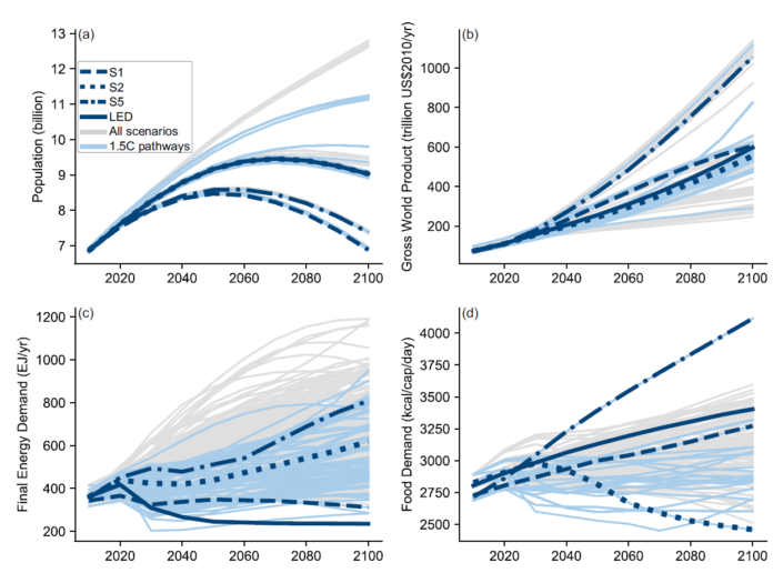
Figure 1. The IPCCs Shared Sustainability Pathways. Grains of salt required [i].
Click the image to enlarge.
All those spaghetti lines on the graphs (Figure 1) represent output from computer models of the global economic and energy system over the next several decades. Those models are called Integrated Assessment Models (IAMs). Like any model, IAMs arent perfect, but these IAMs are developed by teams of bright, dedicated people, and while that doesnt mean they are reliable, it does mean we should take them seriously.
You can think of each thin line in the figure as charting one possible future, each corresponding to a particular IAM, pursuant to specific parameters. Different scenarioslabeled S1, S2, and S5correspond to the Shared Sustainability Pathways, or SSPs. SSPs are narrative descriptions of future economic conditions used to parameterize the models. In other words, they are qualitative descriptors used to set quantitative values used in the models.
There are five SSPs, but Figure 1 includes only three: S1, S2 and S5. S5 (aka SSP5) is the Fossil Fueled Development scenario, and S2 is the Middle of the Road scenario. But what caught my eye is S1 (aka SSP1), the Sustainable Development pathway.
In the bottom left graph, final energy demand in the S1 scenario flattens, then decreases slightly towards the end of the century. This makes sense with sustainability. In the S1 scenario of the top right graph, Gross World Product increases roughly fourfold over the next 80 years. The question then becomes: Is this even possible? Is it possible to dramatically increase the value of the goods and services on Earth without increasing energy use? To answer that, we need to get into the weeds of the IPCCs Sustainable Development Pathways.
The goal of the SSP1 model is to present a best-case scenario. Of course, it isnt phrased that way in the report, but thats what it is. It assumes low population growth, divergence from resource-intensive lifestyles, and a rapid shift towards renewable energy.
SSP1 often accompanies another set of numbers such as SSP1-1.9. The 1.9 following SSP1 means that climate change is limited to 1.9 watts/m2 of radiative forcing, keeping temperatures near the Paris Agreement limits. Similarly, SSP1-2.6 also follows the SSP1 pathway, but with temperature creeping a bit higher with 2.6 watts/m2 of forcing and around 2°C of temperature increase.
For now, lets look exclusively at the SSP1-1.9 scenario. According to the IPCC, thats the only one in which we all live happily ever after.
Can This Fairy Tale Come True?
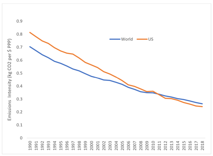
Not all dollars are created equal. All dollars entail energy use, but emissions from producing a dollars worth of COVID antibodies do not equal the emissions from producing a dollars worth of NASCAR entertainment. In the aggregate, per-dollar emissions are declining both domestically and globally (Figure 2). Thats the good news the IPCC banks on with the SSP1 model.
To the untrained eye, Figure 2 suggests that we could, perhaps, drive our emissions intensity down to zero! Of course, we couldnt suffer much NASCAR. Or Hummers. Or dirt bikes, ATVs, or jet skies. Or airline travel. Or war games (much less wars). But theres a much bigger problem with the IPCCs logic. Theyre overlooking the trophic theory of money.
We cant have any COVID antibody research, development, production, and distribution without plenty of agricultural and extractive activity at the trophic base of the economy. Those antibody dollars, then, entail a much higher emissions footprint than the footprint committed directly within the lab. The more antibody labsand cancer facilities, internet hubs, intelligence units, etc.required in the face of increasing threats, the more energy required to fuel the trophic base of the economy. Apparently the IPCC thinks all that increased fueling could be accomplished without fossil fuels.

Figure 2. Historic emissions intensity of the USA and world,
based on data from the World Bank, 1990-2018.
Click the image to enlarge.
I have my doubts. I think the decline in the emissions intensity of the average dollar has little to do with increasing productive efficiency or reduced carbon intensity of electricity. Rather, its due primarily to the development of low-emissions high-value production. In other words, this trend stems mostly from activities seated highly in the trophic structure of the economy: information services, healthcare and biotech, and other sectors that seemingly produce lots of GDP without copious emissions. Until, that is, you consider the underlying trophics.
When you do consider the trophic structure of the economy, you begin to understand the profundity of the challenges we face. The challenges go beyond emissions, too. Conserving biodiversity, avoiding supply shocks, maintaining peace among neighboring nations; all such goals must be squared with the trophic realities of economic structure.
That said, the decline in emissions per dollar is impressive, dropping globally from 0.7 kg per dollar in 1990 to 0.26 kg per dollar less than 30 years later. Even for a Hobbesian pessimist like myself, this is good news. It suggests we might buy some additional time before worst-case scenarios unfold.
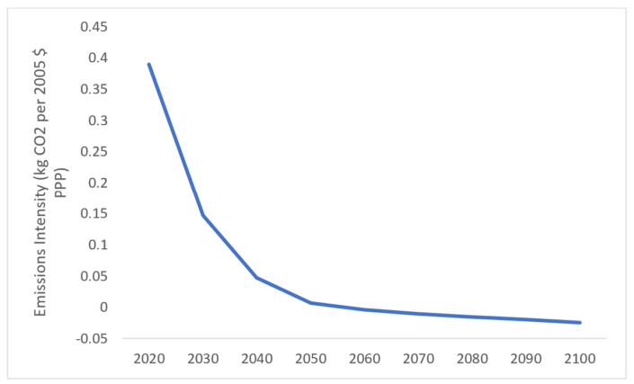
Figure 3. Emissions intensity from the output of the
SSP1-1.9 IMAGE integrated assessment model.
Click the image to enlarge.
The IPCC is no Hobbes, though. According to SSP1-1.9, the emissions intensity of the global economy reaches zero by 2050, then becomes negative (due to carbon sequestration). This allows for a thorough decoupling of economic growth from emissions, and then some!
I believe the IPCCs best-case scenario is too good to be true. Specifically, I dont think Earth is big enough to produce all the food and bioenergy the model requires, especially with the trophic context in mind.
The model assumes that total biomass use increases from about 50 EJ per year to about 250 EJ per year in 2100. Such an assumption is at the limits of plausibility. At the same time, the model assumes that non-energy crop production increases from 4-billion tons per year to 5.5, and that livestock production increases from 300-million tons to nearly 350 in 2050, before returning to around 300-million tons in 2100. Without agricultural innovation on the scale of the Green Revolution or continued deforestation, its hard to see how Earths systems could accommodate this demand. Its especially hard to see, given the water shortages facing many regions.
Furthermore, a heavy dependence on bioenergywith carbon capture and sequestrationis what allows for the negative emissions, or a reduction in emissions intensity to less than zero. If sufficient land isnt available for bioenergy and carbon sequestration (which are ultimately competing interests), temperature increases wont be limited to 1.5°C.
Miserable Evermore?
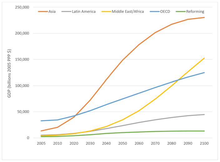
The IPCCs model for meeting the Paris Agreements targets are unrealistic in more ways than one. Asia and Africas populations will grow despite the models optimistic population assumptions, creating a genuine need for significant economic growth (Figure 4). Even CASSE, the organization most serious about degrowth and steady statesmanship, calls for economic growth in nations with widespread poverty.

Figure 4. Economic growth by region in the IMAGE SSP1-1.9 model.
Click the image to enlarge.
The model also assumes that the 38 member nations of the Organization for Economic Co-operation and Development (OECD) roughly triple the size of their economies over the next 80 years. This makes the job of meeting the Paris Agreements goals far more difficult; triply more difficult, we might say.
In sum, the IPCCs SS1-1.9 models are highly unlikely; indeed scarcely plausible. The difficult but doable option of reducing GDP in the OECD could be the difference between everyone living happily ever after, and all of us being miserable forevermore.
Footnotes
[i] Original caption on the IPCC report, Figure 2.4: "Range of assumptions about socio-economic drivers and projections for energy and food demand in the pathways available to this assessment. 1.5°C-consistent pathways are blue, other pathways grey. Trajectories for the illustrative 1.5°C-consistent archetypes used in the Chapter (LED, S1, S2, S5; referred to as P1, P2, P3, and P4 in the Summary for Policymakers.) are highlighted. S1 is a sustainability oriented scenario, S2 is a middle-of-the-road scenario, and S5 is a fossil-fuel intensive and high energy demand scenario. LED is a scenario with particularly low energy demand. Population assumptions in S2 and LED are identical. Panels show (a) world population, (b) gross world product in purchasing power parity values, (CASSE) final energy demand, and (d) food demand."
|
ABOUT THE AUTHOR
Brian Snyder is Assistant Professor in the Department of Environmental Sciences at Louisiana State University, CASSE chapter director, and a regular contributor to the Steady State Herald.
|


![[groups_small]](groups_small.gif)