Ive been trawling through the final draft of the new IPCC assessment report that was released last week, to extract some highlights for a talk I gave yesterday. Heres what I think are its key messages:
- The warming is unequivocal.
- Humans caused the majority of it.
- The warming is largely irreversible.
- Most of the heat is going into the oceans.
- Current rates of ocean acidification are unprecedented.
- We have to choose which future we want very soon.
- To stay below 2°C of warming, the world must become carbon negative.
- To stay below 2°C of warming, most fossil fuels must stay buried in the ground.
Before I elaborate on these, a little preamble. The IPCC was set up in 1988 as a UN intergovernmental body to provide an overview of the science. Its job is to assess what the peer-reviewed science says, in order to inform policymaking, but it is not tasked with making specific policy recommendations. The IPCC and its workings seem to be widely misunderstood in the media. The dwindling group of people who are still in denial about climate change particularly like to indulge in IPCC-bashing, which seems like a classic case of blame the messenger. The IPCC itself has a very small staff (no more than a dozen or so people). However, the assessment reports are written and reviewed by a very large team of scientists (several thousands), all of whom volunteer their time to work on the reports. The scientists are are organised into three working groups: WG1 focuses on the physical science basis, WG2 focuses on impacts and climate adaptation, and WG3 focuses on how climate mitigation can be achieved.
Last week, just the WG1 report was released as a final draft, although it was accompanied by bigger media event around the approval of the final wording on the WG1 Summary for Policymakers. The final version of the full WG1 report, plus the WG2 and WG3 reports, are not due out until spring next year. That means its likely to be subject to minor editing/correcting, and some of the figures might end up re-drawn. Even so, most of the text is unlikely to change, and the major findings can be considered final. Heres my take on the most important findings, along with a key figure to illustrate each.
(1) The warming is unequivocal
The text of the summary for policymakers says Warming of the climate system is unequivocal, and since the 1950s, many of the observed changes are unprecedented over decades to millennia. The atmosphere and ocean have warmed, the amounts of snow and ice have diminished, sea level has risen, and the concentrations of greenhouse gases have increased.
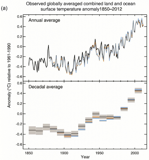
Figure 1. (IPCC Fig SPM.1) Observed globally averaged combined land and ocean surface temperature anomaly 1850-2012. The top panel shows the annual values; the bottom panel shows decadal means. (Note: Anomalies are relative to the mean of 1961-1990).
|
Unfortunately, there has been much play in the press around a silly idea that the warming has paused in the last decade. If you squint at the last few years of the top graph, you might be able to convince yourself that the temperature has been nearly flat for a few years, but only if you cherry pick your starting date, and use a period thats too short to count as climate. When you look at it in the context of an entire century and longer, such arguments are clearly just wishful thinking.
The other thing to point out here is that the rate of warming is unprecedented. With very high confidence, the current rates of CO2, CH4 and N2O rise in atmospheric concentrations and the associated radiative forcing are unprecedented with respect to the highest resolution ice core records of the last 22,000 years, and there is medium confidence that the rate of change of the observed greenhouse gas rise is also unprecedented compared with the lower resolution records of the past 800,000 years. In other words, there is nothing in any of the ice core records that is comparable to what we have done to the atmosphere over the last century. The earth has warmed and cooled in the past due to natural cycles, but never anywhere near as fast as modern climate change.
(2) Humans caused the majority of it
The summary for policymakers says It is extremely likely that human influence has been the dominant cause of the observed warming since the mid-20th century.
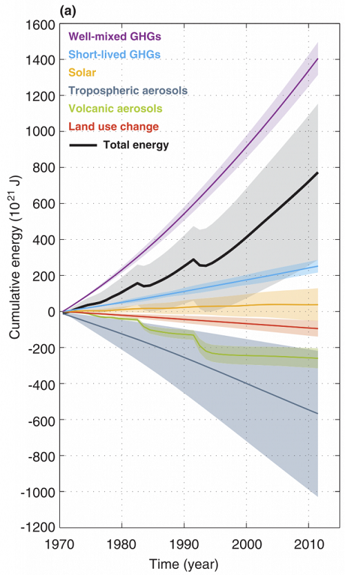
Figure 2. (IPCC Box 13.1 fig 1) The Earths energy budget from 1970 to 2011. Cumulative energy flux (in zettaJoules!) into the Earth system from well-mixed and short-lived greenhouse gases, solar forcing, changes in tropospheric aerosol forcing, volcanic forcing and surface albedo, (relative to 18601879) are shown by the coloured lines and these are added to give the cumulative energy inflow (black; including black carbon on snow and combined contrails and contrail induced cirrus, not shown separately).
|
This chart summarizes the impact of different drivers of warming and/or cooling, by showing the total cumulative energy added to the earth system since 1970 from each driver. Note that the chart is in zettajoules (1021J). For comparison, one zettajoule is about the energy that would be released from 200 million bombs of the size of the one dropped on Hiroshima. The worlds total annual global energy consumption is about 0.5ZJ.
Long lived greenhouse gases, such as CO2, contribute the majority of the warming (the purple line). Aerosols, such as particles of industrial pollution, block out sunlight and cause some cooling (the dark blue line), but nowhere near enough to offset the warming from greenhouse gases. Note that aerosols have the largest uncertainty bar; much of the remaining uncertainty about the likely magnitude of future climate warming is due to uncertainty about how much of the warming might be offset by aerosols. The uncertainty on the aerosols curve is, in turn, responsible for most of the uncertainty on the black line, which shows the total effect if you add up all the individual contributions.
The graph also puts into perspective some of other things that people like to blame for climate change, including changes in energy received from the sun (solar), and the impact of volcanoes. Changes in the sun (shown in orange) are tiny compared to greenhouse gases, but do show a very slight warming effect. Volcanoes have a larger (cooling) effect, but it is short-lived. There were two major volcanic eruptions in this period, El Chichón in 1982 and and Pinatubo in 1992. Each can be clearly seen in the graph as an immediate cooling effect, which then tapers off after a a couple of years.
(3) The warming is largely irreversible
The summary for policymakers says A large fraction of anthropogenic climate change resulting from CO2 emissions is irreversible on a multi-century to millennial time scale, except in the case of a large net removal of CO2 from the atmosphere over a sustained period. Surface temperatures will remain approximately constant at elevated levels for many centuries after a complete cessation of net anthropogenic CO2 emissions.
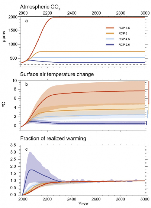
Figure 3. (IPCC Fig 12.43) Results from 1,000 year simulations from EMICs on the 4 RCPs up to the year 2300, followed by constant composition until 3000.
|
The conclusions about irreversibility of climate change are greatly strengthened from the previous assessment report, as recent research has explored this in much more detail. The problem is that a significant fraction of our greenhouse gas emissions stay in the atmosphere for thousands of years, so even if we stop emitting them altogether, they hang around, contributing to more warming. In simple terms, whatever peak temperature we reach, were stuck at for millennia, unless we can figure out a way to artificially remove massive amounts of CO2 from the atmosphere.
The graph is the result of an experiment that runs (simplified) models for a thousand years into the future. The major climate models are generally too computational expensive to be run for such a long simulation, so these experiments use simpler models, so-called EMICS (Earth system Models of Intermediate Complexity).
The four curves in this figure correspond to four Representative Concentration Pathways, which map out four ways in which the composition of the atmosphere is likely to change in the future. These four RCPs were picked to capture four possible futures: two in which there is little to no coordinated action on reducing global emissions (worst case RCP8.5 and best case RCP6) and two on which there is serious global action on climate change (worst case RCP4.5 and best case RCP 2.6). A simple way to think about them is as follows. RCP8.5 represents business as usual strong economic development for the rest of this century, driven primarily by dependence on fossil fuels. RCP6 represents a world with no global coordinated climate policy, but where lots of localized clean energy initiatives do manage to stabilize emissions by the latter half of the century. RCP4.5 represents a world that implements strong limits on fossil fuel emissions, such that greenhouse gas emissions peak by mid-century and then start to fall. RCP2.6 is a world in which emissions peak in the next few years, and then fall dramatically, so that the world becomes carbon neutral by about mid-century.
Note that in RCP2.6 the temperature does fall, after reaching a peak just below 2°C of warming over pre-industrial levels. Thats because RCP2.6 is a scenario in which concentrations of greenhouse gases in the atmosphere start to fall before the end of the century. This is only possible if we reduce global emissions so fast that we achieve carbon neutrality soon after mid-century, and then go carbon negative. By carbon negative, I mean that globally, each year, we remove more CO2 from the atmosphere than we add. Whether this is possible is an interesting question. But even if it is, the model results show there is no time within the next thousand years when it is anywhere near as cool as it is today.
(4) Most of the heat is going into the oceans
The oceans have a huge thermal mass compared to the atmosphere and land surface. They act as the planets heat storage and transportation system, as the ocean currents redistribute the heat. This is important because if we look at the global surface temperature as an indication of warming, were only getting some of the picture. The oceans act as a huge storage heater, and will continue to warm up the lower atmosphere (no matter what changes we make to the atmosphere in the future).
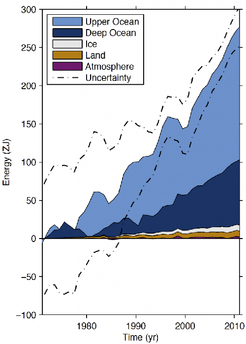
Figure 4. (IPCC Box 3.1 Fig 1) Plot of energy accumulation in ZJ (1 ZJ = 1021 J) within distinct components of Earths climate system relative to 1971 and from 19712010 unless otherwise indicated. Ocean warming (heat content change) dominates, with the upper ocean (light blue, above 700 m) contributing more than the deep ocean (dark blue, below 700 m; including below 2000 m estimates starting from 1992). Ice melt (light grey; for glaciers and ice caps, Greenland and Antarctic ice sheet estimates starting from 1992, and Arctic sea ice estimate from 19792008); continental (land) warming (orange); and atmospheric warming (purple; estimate starting from 1979) make smaller contributions. Uncertainty in the ocean estimate also dominates the total uncertainty (dot-dashed lines about the error from all five components at 90% confidence intervals).
|
Note the relationship between this figure (which shows where the heat goes) and the figure I showed above that shows change in cumulative energy budget from different sources. Both graphs show zettajoules accumulating over about the same period (1970-2011). But the first graph has a cumulative total just short of 800ZJ by the end of the period, while this one shows the earth storing only about 300ZJ of this. Where did the remaining energy go? Because the earths temperature rose during this period, it also lost increasingly more energy back into space. When greenhouse gases trap heat, the earths temperature keeps rising until outgoing energy and incoming energy are in balance again.
(5) Current rates of ocean acidification are unprecedented.
The IPCC report says The pH of seawater has decreased by 0.1 since the beginning of the industrial era, corresponding to a 26% increase in hydrogen ion concentration.
It is virtually certain that the increased storage of carbon by the ocean will increase acidification in the future, continuing the observed trends of the past decades.
Estimates of future atmospheric and oceanic carbon dioxide concentrations indicate that, by the end of this century, the average surface ocean pH could be lower than it has been for more than 50 million years.
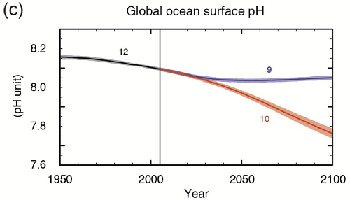
Figure 5. (IPCC Fig SPM.7c) CMIP5 multi-model simulated time series from 1950 to 2100 for global mean ocean surface pH. Time series of projections and a measure of uncertainty (shading) are shown for scenarios RCP2.6 (blue) and RCP8.5 (red). Black (grey shading) is the modelled historical evolution using historical reconstructed forcings. [The numbers indicate the number of models used in each ensemble.]
|
Ocean acidification has sometimes been ignored in discussions about climate change, but it is a much simpler process, and is much easier to calculate (notice the uncertainty range on the graph above is much smaller than most of the other graphs). This graph shows the projected acidification in the best and worst case scenarios (RCP2.6 and RCP8.5). Recall that RCP8.5 is the business as usual future.
Note that this doesnt mean the ocean will become acid. The ocean has always been slightly alkaline well above the neutral value of pH7. So acidification refers to a drop in pH, rather than a drop below pH7. As this continues, the ocean becomes steadily less alkaline. Unfortunately, as the pH drops, the ocean stops being supersaturated for calcium carbonate. If its no longer supersaturated, anything made of calcium carbonate starts dissolving. Corals and shellfish can no longer form. If you kill these off, the entire ocean foodchain is affected. Heres what the IPCC report says: Surface waters are projected to become seasonally corrosive to aragonite in parts of the Arctic and in some coastal upwelling systems within a decade, and in parts of the Southern Ocean within 13 decades in most scenarios. Aragonite, a less stable form of calcium carbonate, undersaturation becomes widespread in these regions at atmospheric CO2 levels of 500600 ppm.
(6) We have to choose which future we want very soon.
In the previous IPCC reports, projections of future climate change were based on a set of scenarios that mapped out different ways in which human society might develop over the rest of this century, taking account of likely changes in population, economic development and technological innovation. However, none of the old scenarios took into account the impact of strong global efforts at climate mitigation. In other words, they all represented futures in which we dont take serious action on climate change. For this report, the new RCPs have been chosen to allow us to explore the choice we face.
This chart sums it up nicely. If we do nothing about climate change, were choosing a path that will look most like RCP8.5. Recall that this is the one where emissions keep rising just as they have done throughout the 20th century. On the other hand, if we get serious about curbing emissions, well end up in a future thats probably somewhere between RCP2.6 and RCP4.5 (the two blue lines). All of these futures give us a much warmer planet. All of these futures will involve many challenges as we adapt to life on a warmer planet. But by curbing emissions soon, we can minimize this future warming.
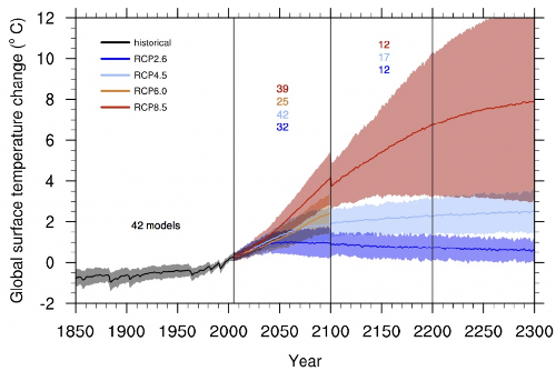
Figure 6. (IPCC Fig 12.5) Time series of global annual mean surface air temperature anomalies (relative to 19862005) from CMIP5 concentration-driven experiments. Projections are shown for each RCP for the multi model mean (solid lines) and the 595% range (±1.64 standard deviation) across the distribution of individual models (shading). Discontinuities at 2100 are due to different numbers of models performing the extension runs beyond the 21st century and have no physical meaning. Only one ensemble member is used from each model and numbers in the figure indicate the number of different models contributing to the different time periods. No ranges are given for the RCP6.0 projections beyond 2100 as only two models are available.
|
Note also that the uncertainty range (the shaded region) is much bigger for RCP8.5 than it is for the other scenarios. The more the climate changes beyond what weve experienced in the recent past, the harder it is to predict what will happen. We tend to use the difference across different models as an indication of uncertainty (the coloured numbers shows how many different models participated in each experiment). But theres also the possibility of unknown unknowns surprises that arent in the models, so the uncertainty range is likely to be even bigger than this graph shows.
(7) To stay below 2°C of warming, the world must become carbon negative.
Only one of the four future scenarios (RCP2.6) shows us staying below the UNs commitment to no more than 2ºC of warming. In RCP2.6, emissions peak soon (within the next decade or so), and then drop fast, under a stronger emissions reduction policy than anyone has ever proposed in international negotiations to date. For example, the post-Kyoto negotiations have looked at targets in the region of 80% reductions in emissions over say a 50 year period. In contrast, the chart below shows something far more ambitious: we need more than 100% emissions reductions. We need to become carbon negative:
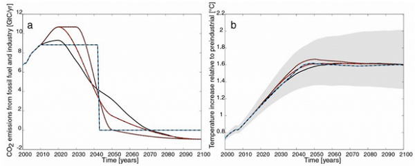
Figure 7. (IPCC Figure 12.46) a) CO2 emissions for the RCP2.6 scenario (black) and three illustrative modified emission pathways leading to the same warming, b) global temperature change relative to preindustrial for the pathways shown in panel (a).
|
The graph on the left shows four possible CO2 emissions paths that would all deliver the RCP2.6 scenario, while the graph on the right shows the resulting temperature change for these four. They all give similar results for temperature change, but differ in how we go about reducing emissions. For example, the black curve shows CO2 emissions peaking by 2020 at a level barely above todays, and then dropping steadily until emissions are below zero by about 2070. Two other curves show what happens if emissions peak higher and later: the eventual reduction has to happen much more steeply. The blue dashed curve offers an implausible scenario, so consider it a thought experiment: if we held emissions constant at todays level, we have exactly 30 years left before we would have to instantly reduce emissions to zero forever.
Notice where the zero point is on the scale on that left-hand graph. Ignoring the unrealistic blue dashed curve, all of these pathways require the world to go net carbon negative sometime soon after mid-century. None of the emissions targets currently being discussed by any government anywhere in the world are sufficient to achieve this. We should be talking about how to become carbon negative.
One further detail. The graph above shows the temperature response staying well under 2°C for all four curves, although the uncertainty band reaches up to 2°C. But note that this analysis deals only with CO2. The other greenhouse gases have to be accounted for too, and together they push the temperature change right up to the 2°C threshold. Theres no margin for error.
(8) To stay below 2°C of warming, most fossil fuels must stay buried in the ground.
Perhaps the most profound advance since the previous IPCC report is a characterization of our global carbon budget. This is based on a finding that has emerged strongly from a number of studies in the last few years: the expected temperature change has a simple linear relationship with cumulative CO2 emissions since the beginning of the industrial era:
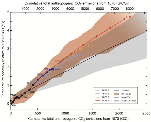
Figure 8. (IPCC Figure SPM.10) Global mean surface temperature increase as a function of cumulative total global CO2 emissions from various lines of evidence. Multi-model results from a hierarchy of climate-carbon cycle models for each RCP until 2100 are shown with coloured lines and decadal means (dots). Some decadal means are indicated for clarity (e.g., 2050 indicating the decade 2041-2050). Model results over the historical period (18602010) are indicated in black. The coloured plume illustrates the multi-model spread over the four RCP scenarios and fades with the decreasing number of available models in RCP8.5. The multi-model mean and range simulated by CMIP5 models, forced by a CO2 increase of 1% per year (1% per year CO2 simulations), is given by the thin black line and grey area. For a specific amount of cumulative CO2 emissions, the 1% per year CO2 simulations exhibit lower warming than those driven by RCPs, which include additional non-CO2 drivers. All values are given relative to the 1861-1880 base period. Decadal averages are connected by straight lines.
|
The chart is a little hard to follow, but the main idea should be clear: whichever experiment we carry out, the results tend to lie on a straight line on this graph. You do get a slightly different slope in one experiment, the 1%/yr experiment, where only CO2 rises, and much more slowly than it has over the last few decades. All the more realistic scenarios lie in the orange band, and all have about the same slope.
This linear relationship is a useful insight, because it means that for any target ceiling for temperature rise (e.g. the UNs commitment to not allow warming to rise more than 2°C above pre-industrial levels), we can easily determine a cumulative emissions budget that corresponds to that temperature. So that brings us to the most important paragraph in the entire report, which occurs towards the end of the summary for policymakers:
Limiting the warming caused by anthropogenic CO2 emissions alone with a probability of >33%, >50%, and >66% to less than 2°C since the period 18611880, will require cumulative CO2 emissions from all anthropogenic sources to stay between 0 and about 1560 GtC, 0 and about 1210 GtC, and 0 and about 1000 GtC since that period respectively. These upper amounts are reduced to about 880 GtC, 840 GtC, and 800 GtC respectively, when accounting for non-CO2 forcings as in RCP2.6. An amount of 531 [446 to 616] GtC, was already emitted by 2011.
Unfortunately, this paragraph is a little hard to follow, perhaps because there was a major battle over the exact wording of it in the final few hours of inter-governmental review of the Summary for Policymakers. Several oil states objected to any language that put a fixed limit on our total carbon budget. The compromise was to give several different targets for different levels of risk. Lets unpick them. First notice that the targets in the first sentence are based on looking at CO2 emissions alone; the lower targets in the second sentence take into account other greenhouse gases, and other earth systems feedbacks (e.g. release of methane from melting permafrost), and so are much lower. Its these targets that really matter:
- To give us a one third (33%) chance of staying below 2°C of warming over pre-industrial levels, we cannot ever emit more than 880 gigatonnes of Carbon.
- To give us a 50% chance, we cannot ever emit more than 840 gigatonnes of Carbon.
- To give us a 66% chance, we cannot ever emit more than 800 gigatonnes of Carbon.
Since the beginning of industrialization, we have already emitted a little more than 500 gigatonnes. So our remaining budget is somewhere between 300 and 400 gigatonnes of carbon. Existing known fossil fuel reserves are enough to release at least 1000 gigatonnes. New discoveries and unconventional sources will likely more than double this. That leads to one inescapable conclusion:
Most of the remaining fossil fuel reserves must stay buried in the ground.
Weve never done that before. There is no political or economic system anywhere in the world currently that can persuade an energy company to leave a valuable fossil fuel resource untapped. There is no government in the world that has demonstrated the ability to forgo the economic wealth from natural resource extraction, for the good of the planet as a whole. Were lacking both the political will and the political institutions to achieve this. Finding a way to achieve this presents us with a challenge far bigger than we ever imagined.
ABOUT THE AUTHOR
Steve M. Easterbrook is a professor of Computer Science at the University of Toronto. Professor Easterbrook's research is focused on software engineering for climate system modeling, and the following is a list of recent publications:
- Engineering the Software for Understanding Climate Change, Steve M. Easterbrook and Timothy C. Johns, IEEE Computing in Science and Engineering, November 2009.
- Climate Change: A Software Grand Challenge, Steve M. Easterbrook, Serendipity, 24 August 2010.
- Guest Editors Introduction: Climate Change - Science and Software, S. M. Easterbrook, P. N. Edwards,V. Balaji, R. Budich, IEEE Software, 2011
- Why Systems Thinking?, Steve M. Easterbrook, Serendipity, 20 August 2013.
- The Climate as a System, part 1: the central equilibrium loop, Steve M. Easterbrook, Serendipity, 22 August 2013.
- The Climate as a System, part 2: energy consumption, Steve M. Easterbrook, Serendipity, 26 August 2013.
- The Climate as a System, part 3: greenhouse gases, Steve M. Easterbrook, Serendipity, 27 August 2013.
- The Climate as a System, part 4: earth system feedbacks, Steve M. Easterbrook, Serendipity, 2 September 2013.
- The Climate as a System, part 5: clouds, Steve M. Easterbrook, Serendipity, 3 September 2013.
For more information about this author, see his UT Webpage and his Serendipity Blog.
|


![[groups_small]](groups_small.gif)